Challenges
Statistics from reputable organizations like 1in6 reveal that at least 1 in 6 men have experienced sexual abuse or assault. Moreover, research conducted by Statistque Canada in 2018 showed that out of 100 Canadian male survivors, a staggering 86% experienced emotional impact, yet only 42% reached out for help.
The notion that men should be strong and invulnerable can deter them from seeking support, while the perception of men as dominant and aggressive dismisses their experiences with abuse or violence. The purpose of this project is to give voice to male survivors and provide them with a safe and inclusive space to share their stories, find support, and reclaim their lives. It is also to educate the public audience about male survivors’ experience and to show them how to treat our survivors equally and respectively, in a common sense.
Opportunities
Highlight optimism, community care, and forward-looking hope by a bright visual system that symbolizes understanding, recovery, and warmth.
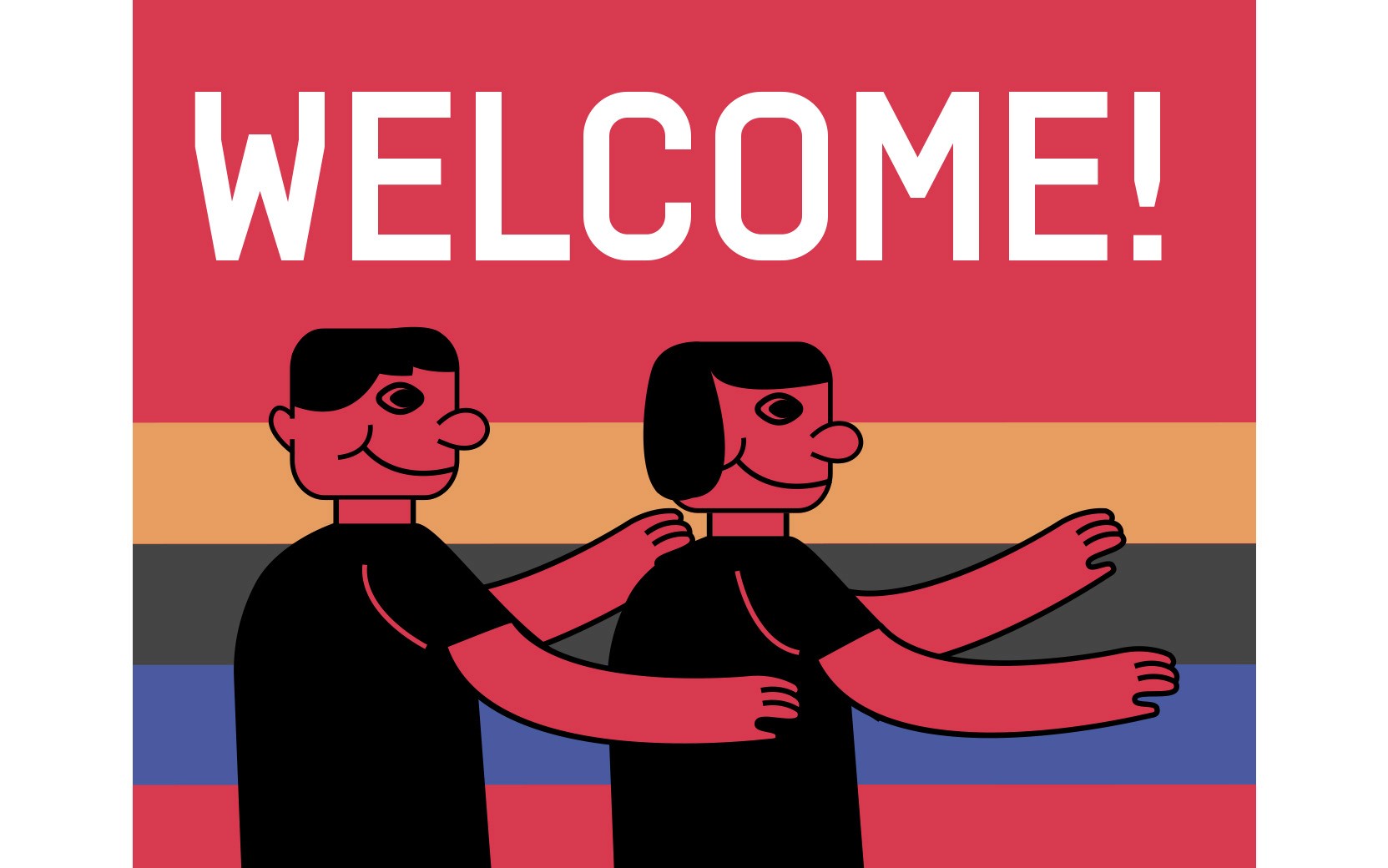
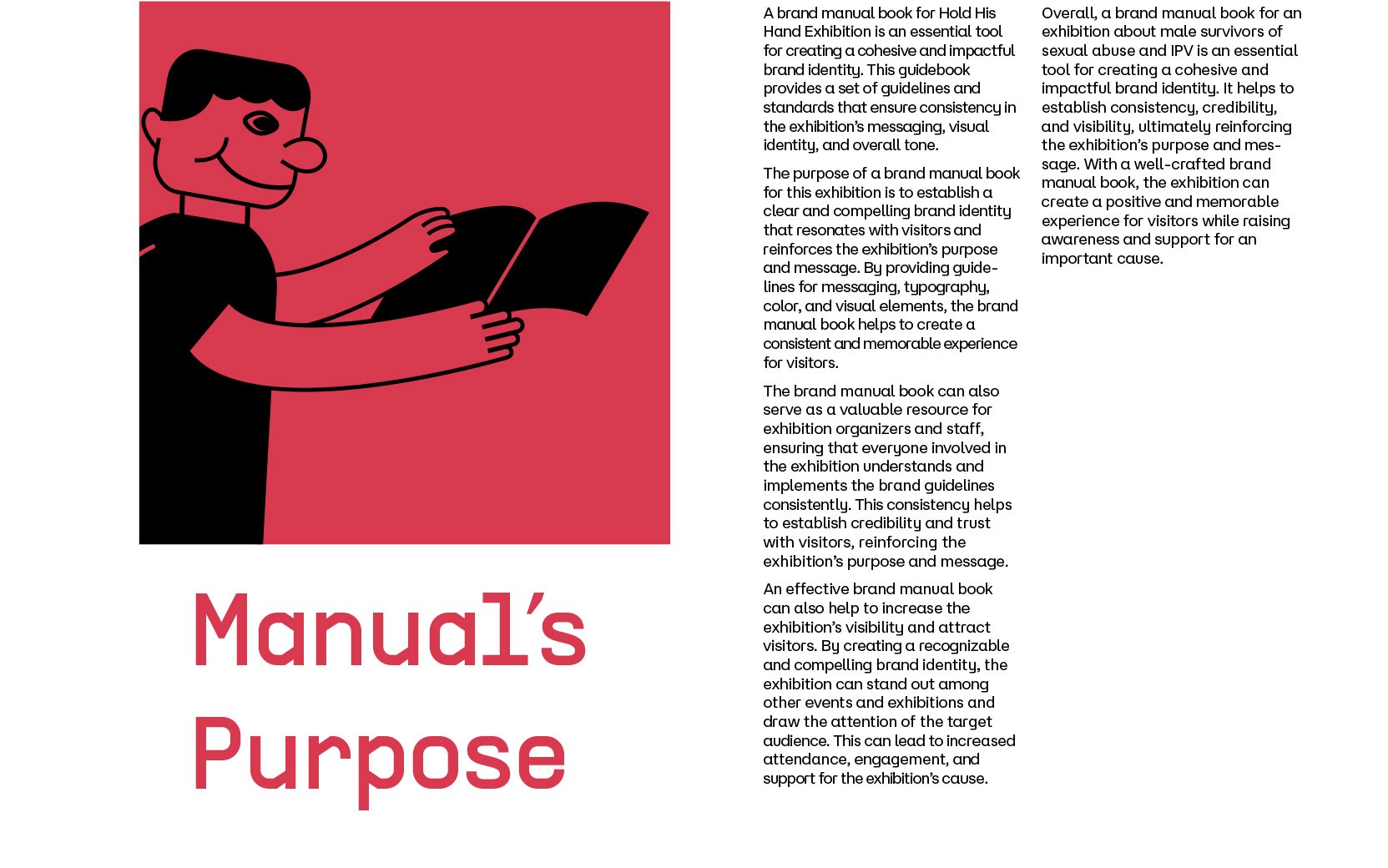
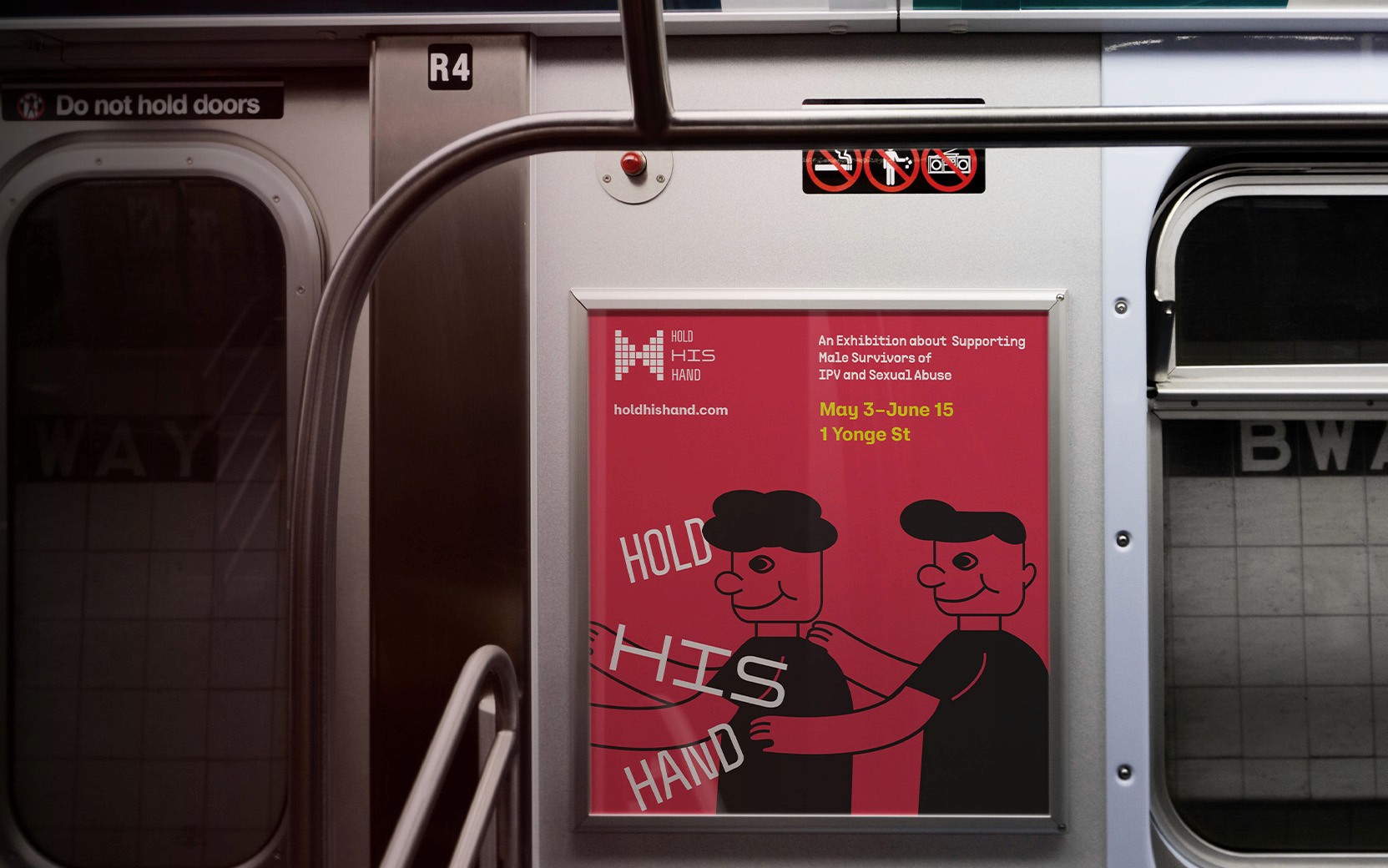
Utilize simple, expressive characters and human emotions as the core visual language to make the heavy topic accessible to everyone and to build a connected visitor journey.
Core Brand Assets
Brandmark—Highligting the Unity
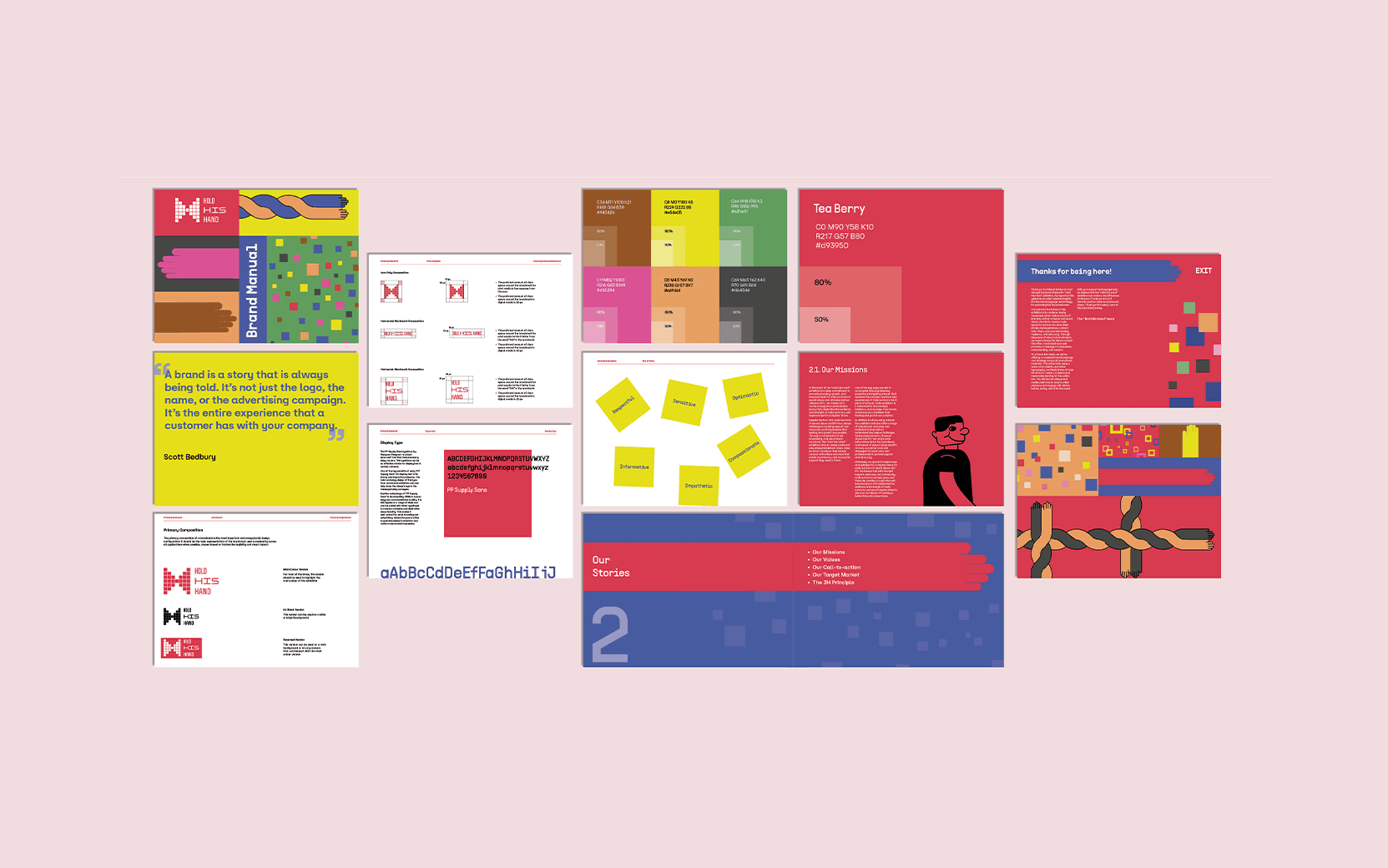
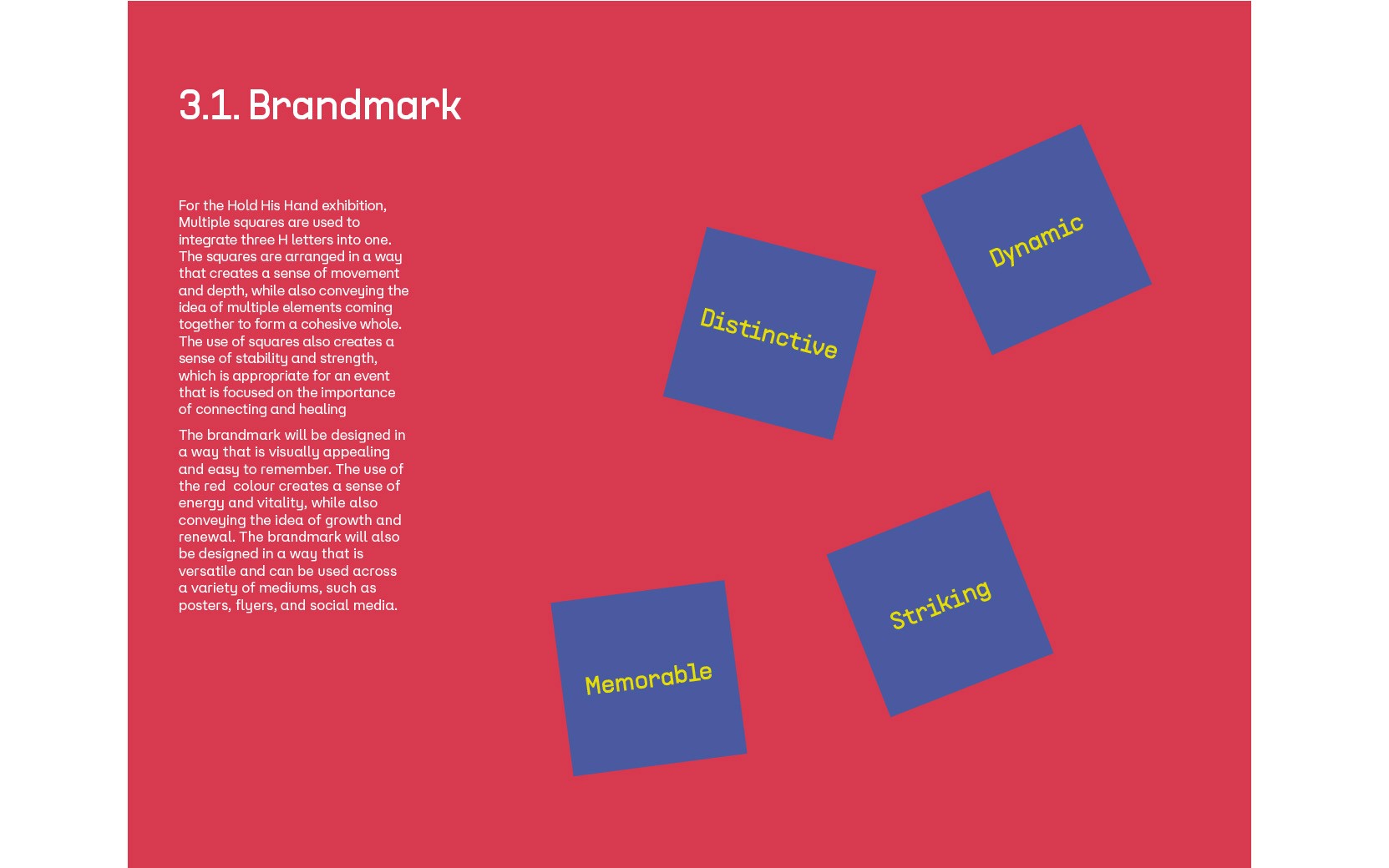
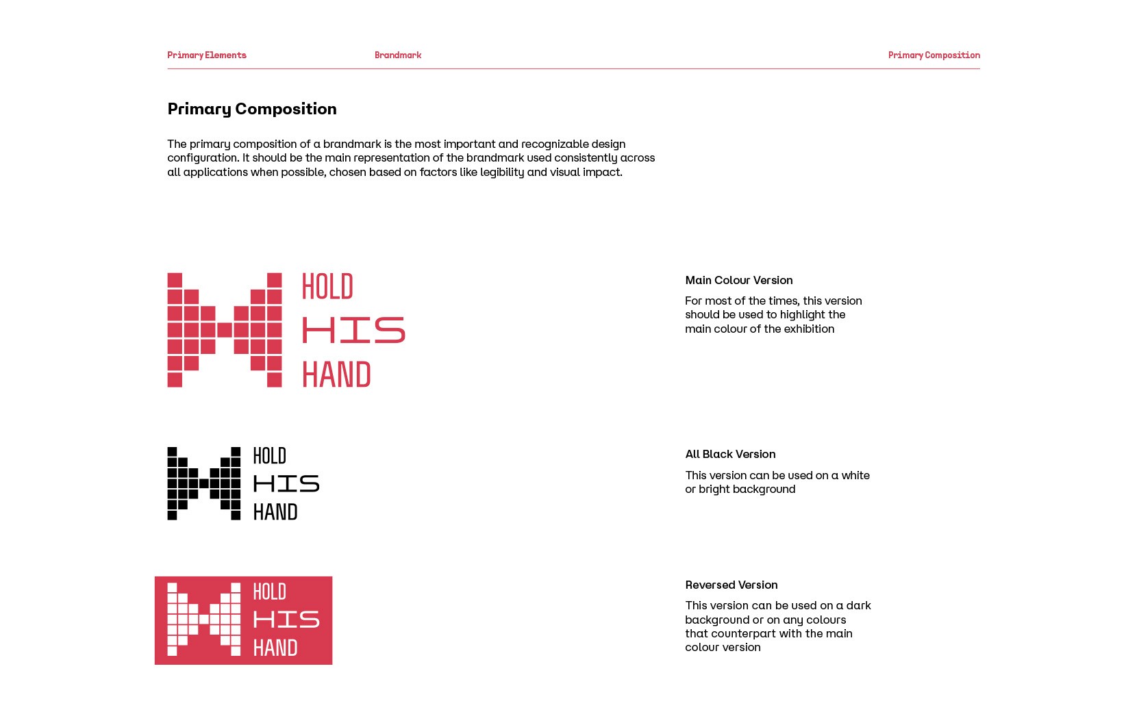
To display the exhibition’s personality, I needed a mark that felt structural yet deeply human. I constructed a core mark using a grid of repeating squares that bridge together to form a larger, unified shape. I chose the square because it represents a stable, foundational building block. By connecting these independent units, the logo becomes a visual metaphor for solidarity—proving that healing doesn’t happen in isolation, and that individual stories can piece together to form a powerful collective voice.

Palette—Avoiding the Stereotype
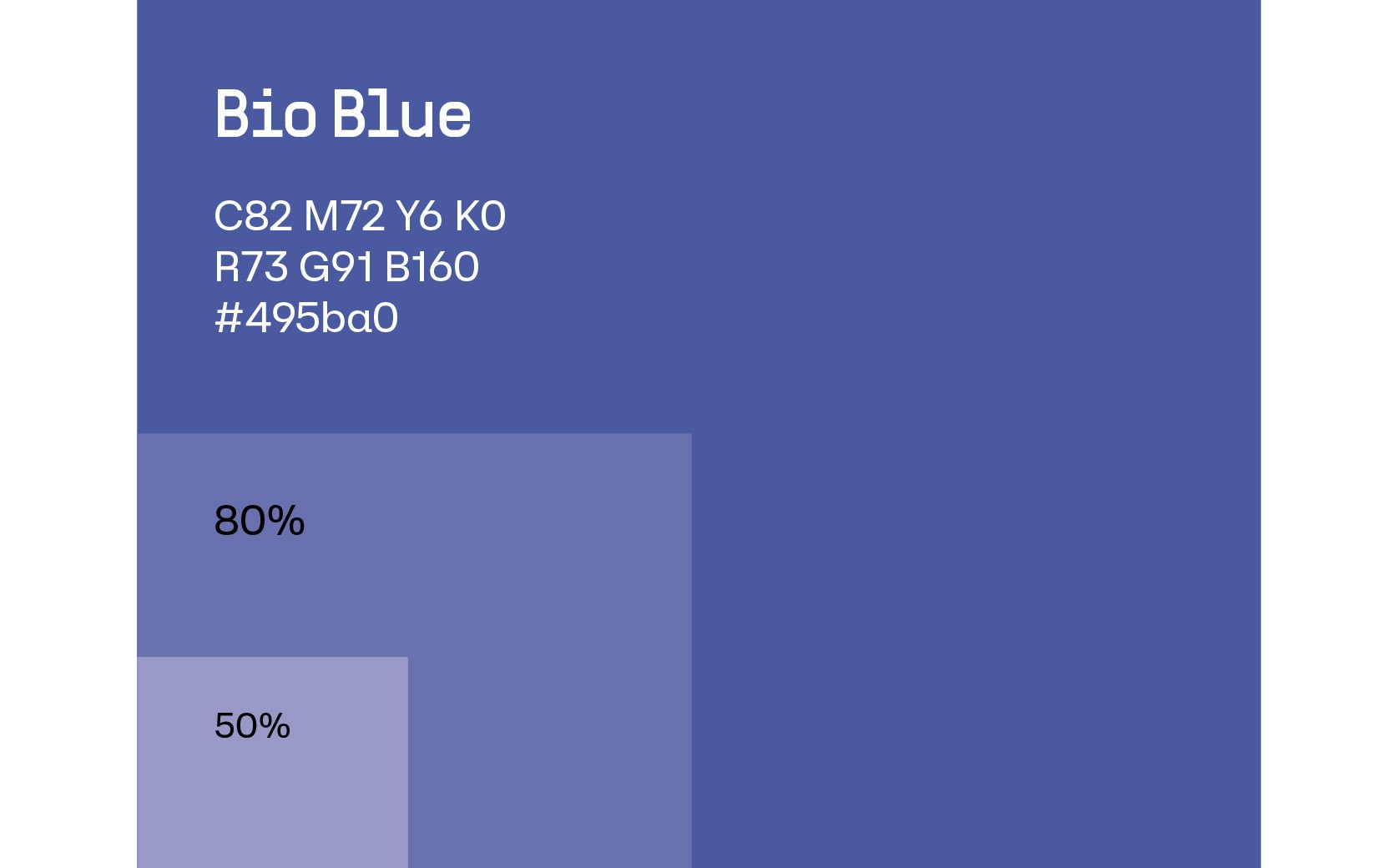
Blue is commonly used to associate with male identity. I wanted to challenge that script.
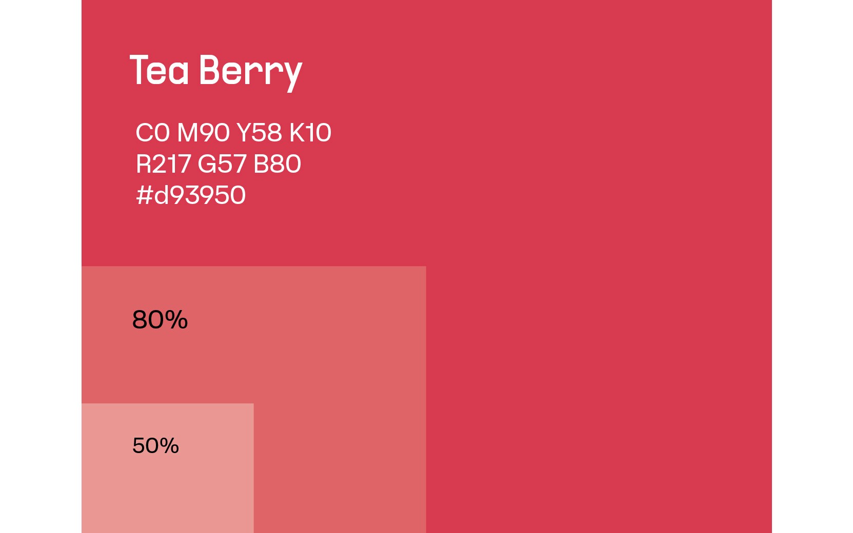
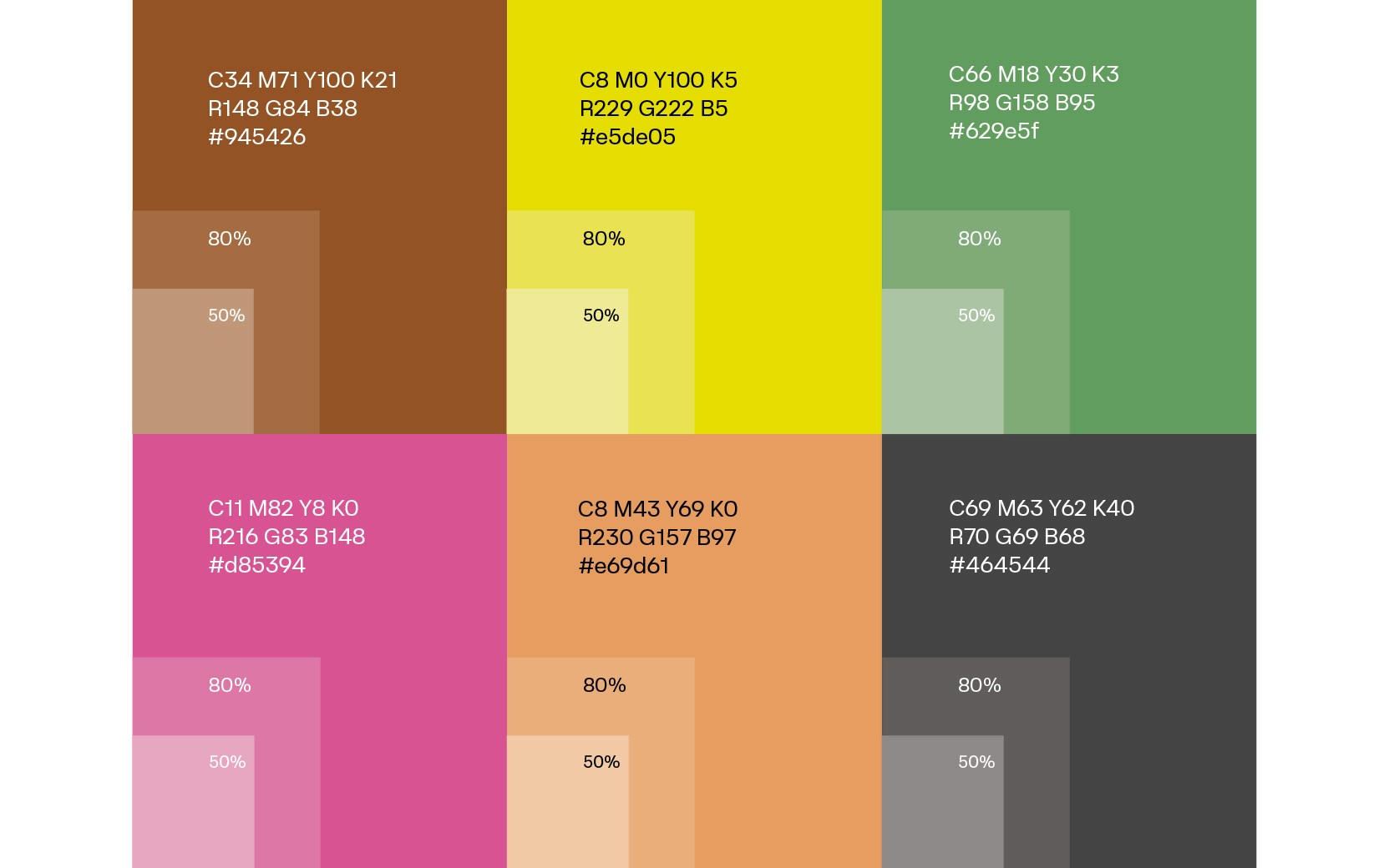
I selected a primary system led by warm, vibrant red tones to deliberately subvert that gender stereotypes. This choice shifts the emotional weight of the exhibition away from clinical detachment and moves it into a space that feels warm, urgent, and deeply rooted in life and energy.
Typography—Structural and Clean
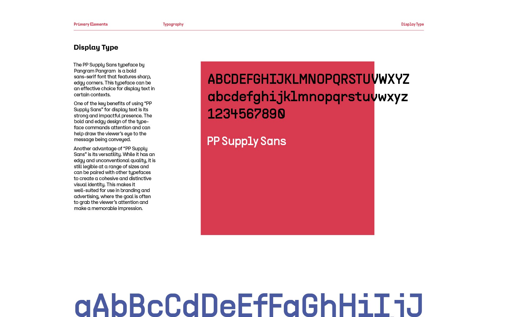
This heavy topic requires a typography system that balances clarity with welcoming comfort. To achieve this, I paired two distinct typefaces:
PP Supply Sans: I selected this as the primary display and structural typeface. Its clean and rigid shape gives the brand an honest, grounded tone. It provides a sense of structure and security, acting as a reliable framework for the exhibition’s message.
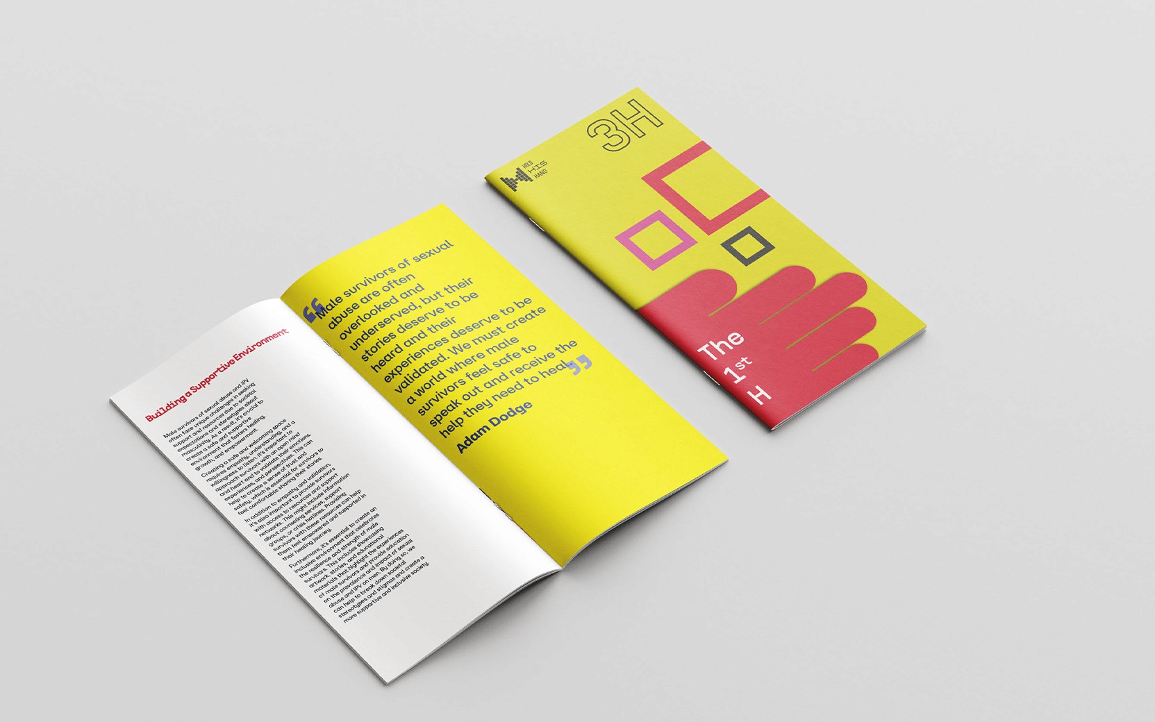
At Aero: I chose this typeface for the editorial layouts and body copy. It balances the strict precision of the display type with its friendly shape and fluid geometry, ensuring that the messages remain readable, comforting, and accessible to every visitor.

Illustration System—Humanizing the Experience
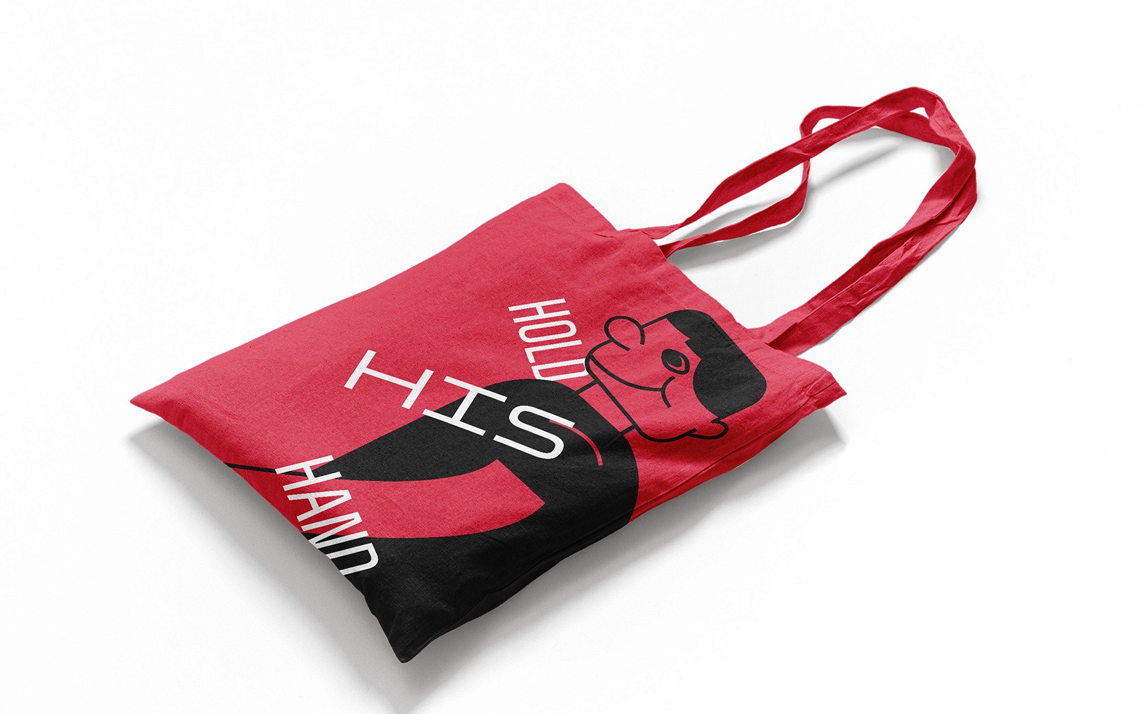
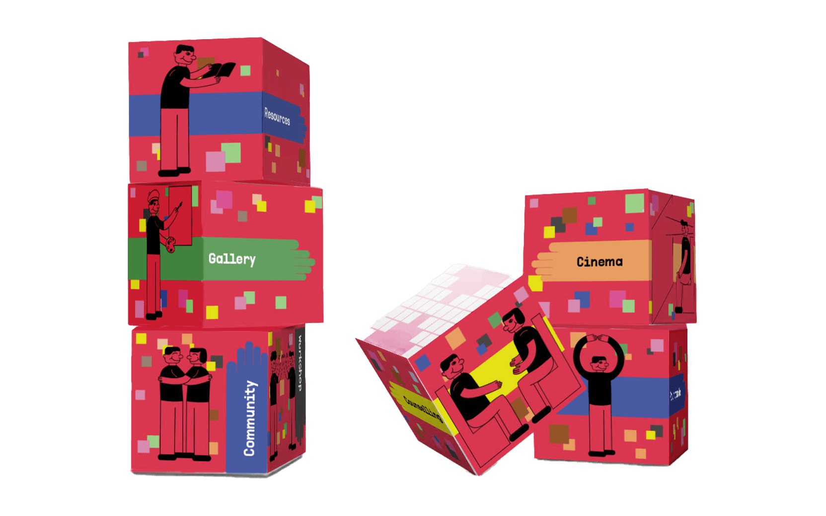
My intention was to develop a cohesive illustration system that could function as an iconographic language. After multiple rounds of developing geometry-based iconographic system, I decided to move away from generic universal signage and instead use these visual assets to humanize every utility within the exhibition.
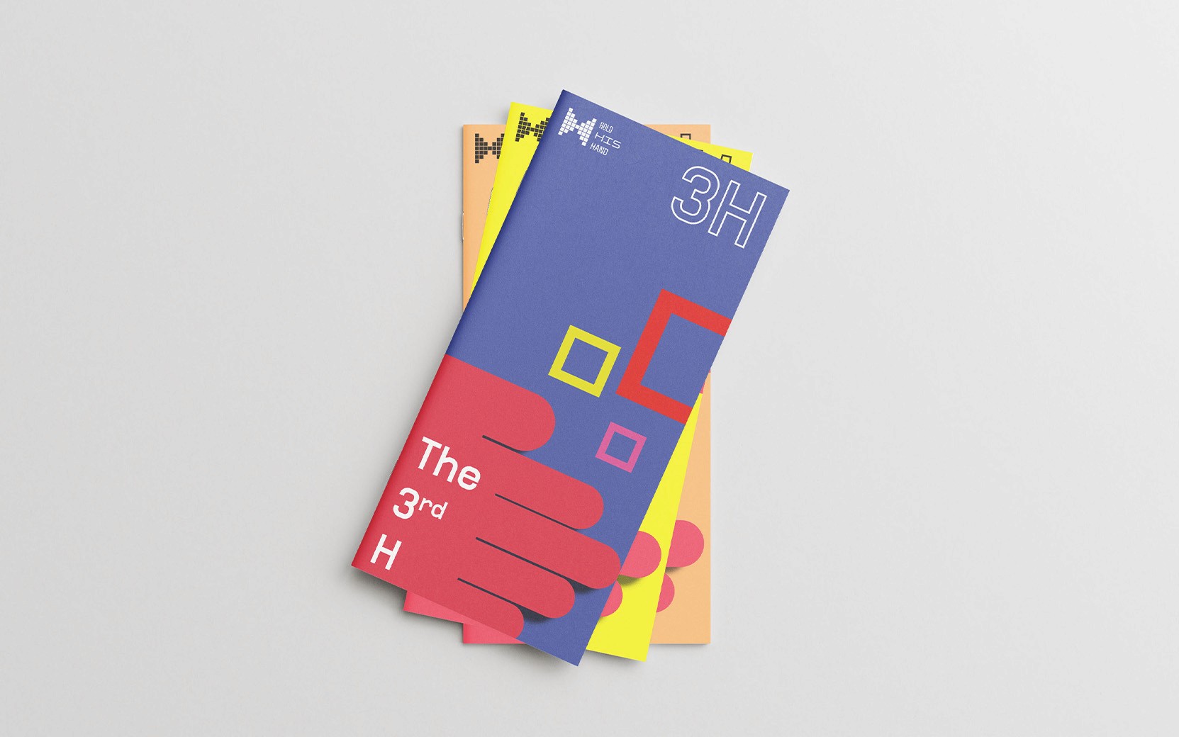
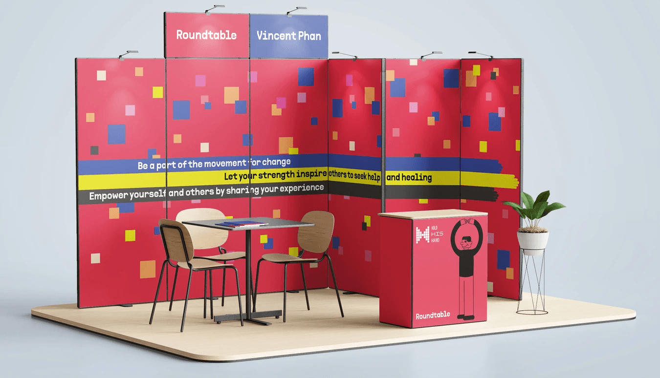
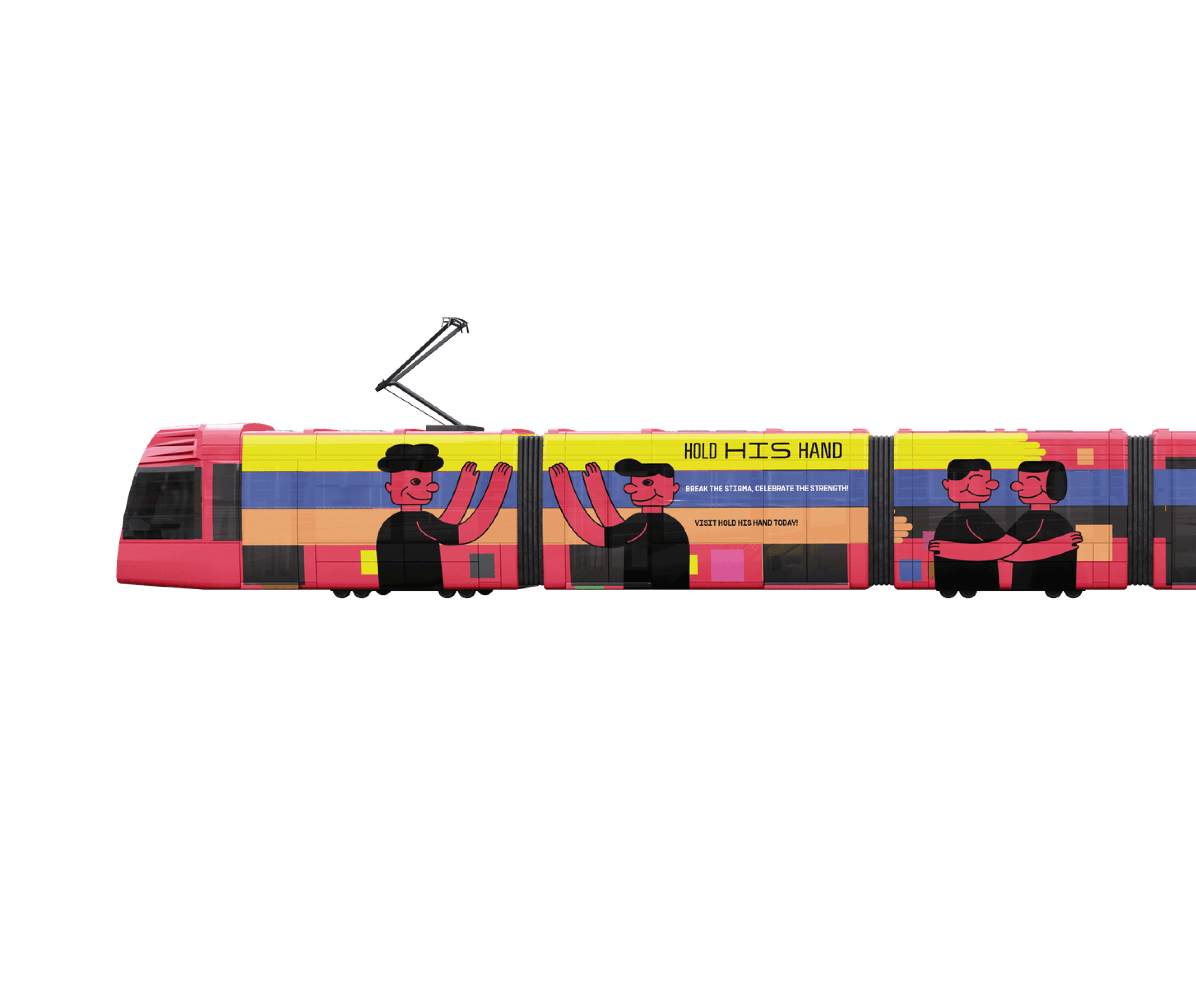
Beyond structural navigation, this iconography system was built to spread our message seamlessly across different media formats. Because the line work is adaptable, these characters are able to scale from tiny directional icons on a digital media, to printed posters and gallery brochures, all the way up to large-scale environmental wall graphics. No matter the medium, they ensure that every physical and digital touchpoint feels safe, approachable, and connected to the exhibition’s message of gentle care.