Challenges
The Nova Scotia Museum of Natural History is dedicated to preserving and celebrating the province’s natural landscape and cultural artifacts. The current branding, has historically served the museum through a long time.
As the museum grows and introduces more interactive, modern programming, the design challenge is to expand this foundational visual identity. The goal of this rebranding project is to move from a structured, text-driven system into a highly versatile, visually communicated system that captures the organic wonder, textures, and dynamic energy found within the museum’s physical and digital exhibits.
Opportunities
Updating the visual language to better reflect the fluid lines, textures, and layers of the natural world
Find ways to bridge multiple exhibit topics—from geology and wildlife to human history—under one cohesive visual system.
Update the communication style to feel more welcoming, approachable, and engaging for visitors of all generations.
Ensure the brand has the flexibility to expand into digital interfaces, physical environments, and community touchpoints.
Core Brand Assets
Brandmark—Connecting to the Ecosystem
My intent was to bridge the gap between two opposing forces inherent to a natural history museum: rigorous scientific classification and the living, organic world.
The outer pillars symbolize data points and the structured framework of taxonomy—the museum’s role as a protector of history. Nestled directly inside this structure, the central fluid form represents the vital spark of nature itself. By uniting these elements, the logo functions as a metaphor for the institution’s mission: holding a secure space where scientific order and natural wonder coexist to tell the story of Nova Scotia.

Palette—Reflecting the Heritage
When developing the color palette, my goal was to create a sense of regional belonging while capturing the organic variety of the natural world.
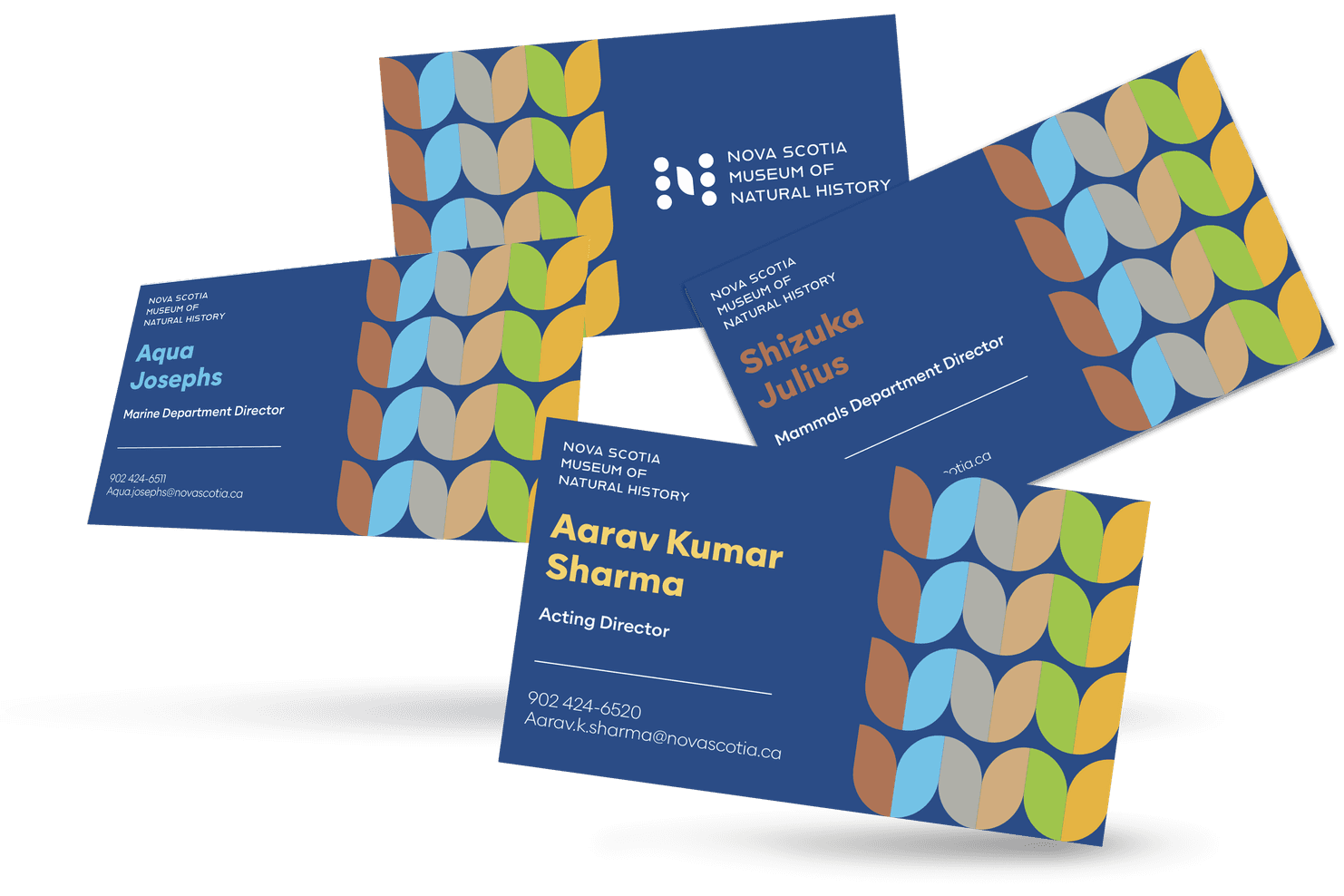
The foundation of the system is intentionally anchored in the historical blue and gold of the Nova Scotia provincial flag. Using these two main colors as our core brand anchors establishes an instant, prideful link to local heritage and the museum’s deep roots in the community.
To complement this regional foundation, I expanded the palette with a spectrum of organic tones directly inspired by nature; evoking the province’s diverse wildlife, rich soil, and dense forests. This blended palette allows the museum to feel connected to both its local identity and the vast biodiversity it protects.

Typography—Accessibility and Openness
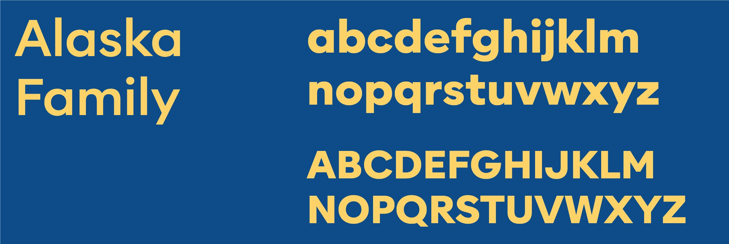
A museum dedicated to natural history should be able communicate with a diverse audience—from academic researchers to curious individuals. I selected Alaska Family as the typeface for the identity to inject a friendly, contemporary openness into the brand.
The clean, open counters and stable geometric structures naturally create a satisfying visual harmony across the entire identity system. By shifting away from traditional, text-heavy serif typefaces, this typographic direction transforms the museum’s voice into one that feels legible, contemporary, and universally welcoming across digital interactive displays and physical signage.
Iconography—Structuring the Collections
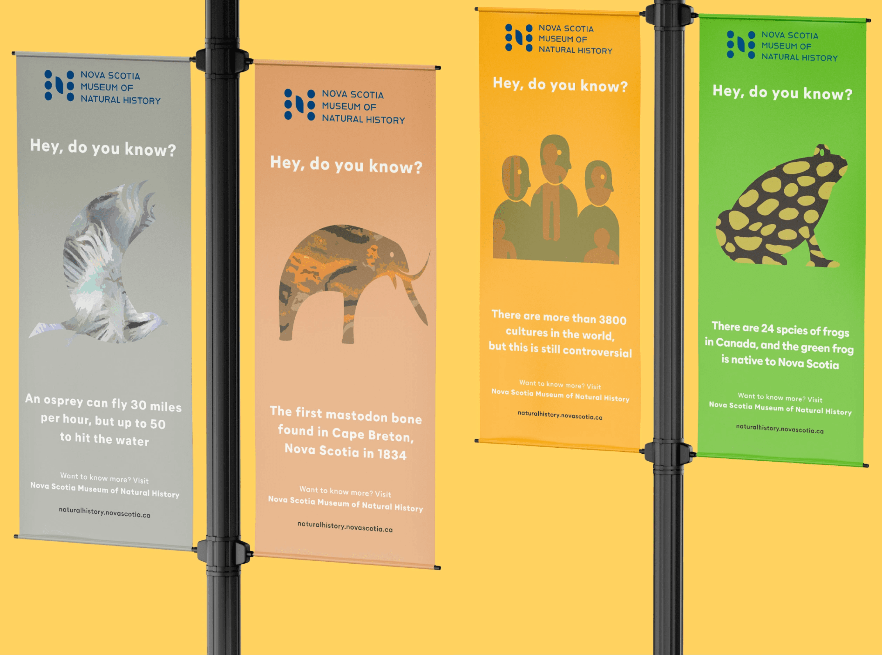
To organize the vast educational wealth of the museum, I designed a specialized iconographic system that bridges complex research disciplines with highly accessible visual identifiers, represents a specific department and core collection: mammals, marine, birds, archaeology, amphibians, and ethnology.
These custom icons are to to fulfill a dual purpose within the brand’s identity:
Textural formats: Utilizes organic textures and intricate patterns directly inside the shapes. This direction captures the tangible, tactile reality of natural history—from animal patterns to ancient archaeological layers—acting as expressive graphic elements for large-scale marketing and editorial layouts.
Simplified and standard formats: This direction provides the brand with functional utility and accessibility, serve as wayfinding icons on museum maps, gallery signage, and digital interactive exhibits.
By structuring the system this way, the iconography shifts the museum away from a collection of separate exhibits into a unified ecosystem.